Kitchen Worktop Colour Trends for 2026: What People Are Actually Choosing in Real Homes
- March 27, 2026
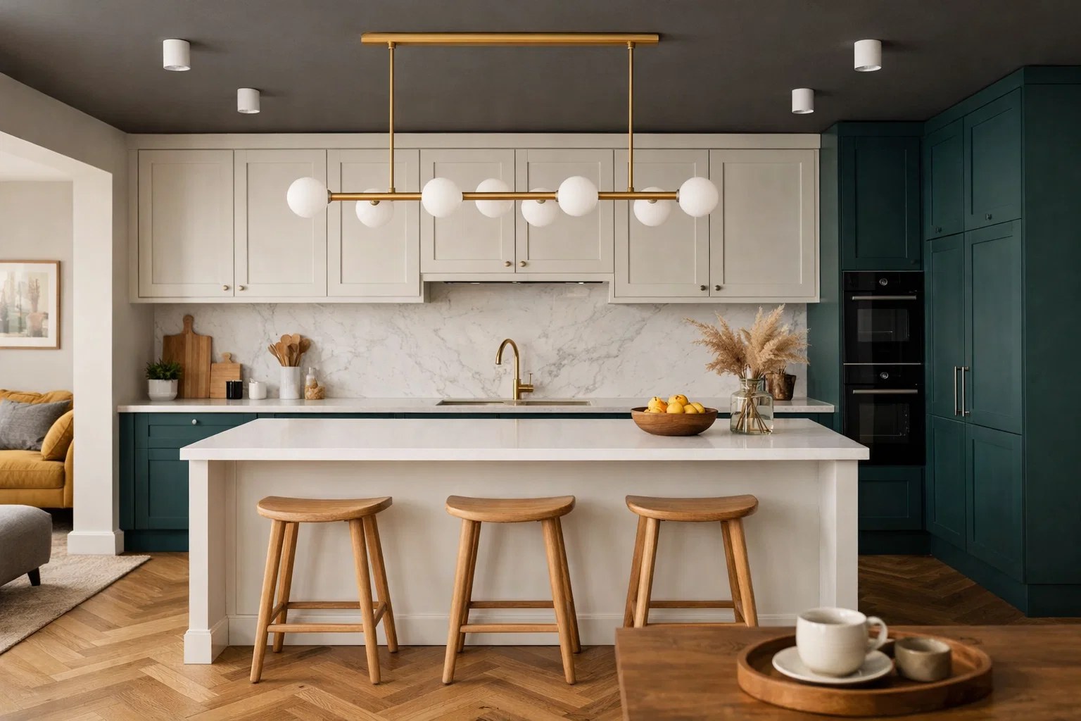
Table of Contents
If you’ve been looking at kitchen worktops lately, you might’ve noticed things feel a bit different compared to a few years ago.
It’s not as simple as “go quartz because it’s practical” or “go granite because it looks premium” anymore. People are paying more attention to how the kitchen actually feels to live with, not just how it looks in a photo.
And a lot of that comes down to colour, even if it doesn’t seem obvious at first.
We’ve seen it quite a bit recently — someone comes in asking for a standard white with grey veins, something they’ve seen online, but once they start looking at full slabs, they naturally drift towards something softer or warmer without even planning to.
It’s less about trends in that sense and more about what people end up choosing when they see everything properly in person.
Warm Whites Are Replacing Cold Whites
White worktops aren’t going anywhere. But the type of white has changed quite a lot.
That bright, almost clinical white with sharp grey veining is slowly losing its appeal. It can still look good, but it often feels a bit too stark, especially in homes that are trying to feel more relaxed and lived-in.
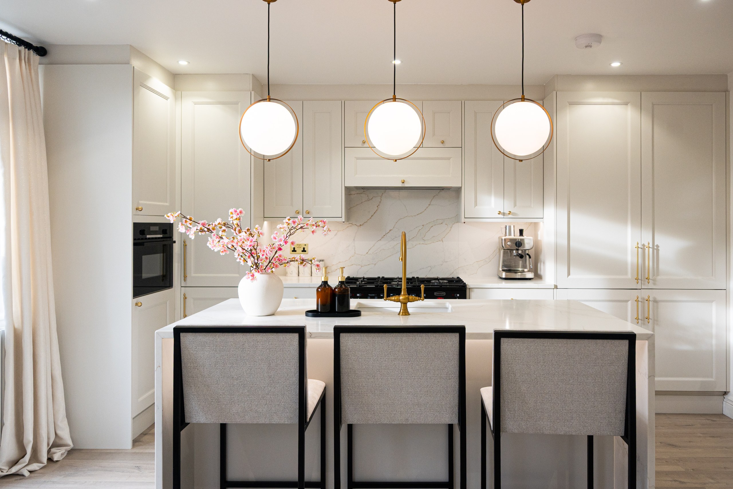
What’s replacing it is warmer whites. Softer backgrounds, subtle movement, and often a touch of gold or beige in the veining.
A good example of this is Calacatta Gold Quartz Worktop or Calacatta Oro Quartz Worktop. They still give you that marble-style look, but without the harsh contrast. It feels calmer, more natural.
Even something like Enzo Quartz Worktop works well if you want a cleaner look but without that overly bright finish.
We’ve seen these used a lot with:
- Beige or off-white cabinets
- Light wood kitchens
- Brushed brass or warm metallic details
It’s still a “safe” choice, but it feels more current.
Earthy Tones Are Quietly Taking Over
This one surprises people.
For years, anything beige or brown was avoided completely. Now it’s coming back – just done properly this time.
Instead of flat, dull colours, you’re getting:
- Soft sand tones
- Warm taupe
- Natural stone-inspired finishes
A really good example is Taj Mahal Quartz Worktop. It’s one of those surfaces that doesn’t shout, but once it’s installed, the whole kitchen feels warmer.
If you want something even more natural, materials like Terra Bruna Brown Quartzite Worktop take that a step further. It has depth, variation, and that slightly imperfect feel you only get with natural stone.
These colours work really well in homes where you don’t want that high-contrast, modern look. It’s more about creating a space that feels calm and easy to live in.
Bold Veining (But Used More Carefully)
Bold, dramatic worktops are still very popular — just used a bit more thoughtfully now.
Instead of covering the entire kitchen in heavy veining, people are focusing it on key areas, usually:
- Kitchen islands
- Feature splashbacks
- Statement sections
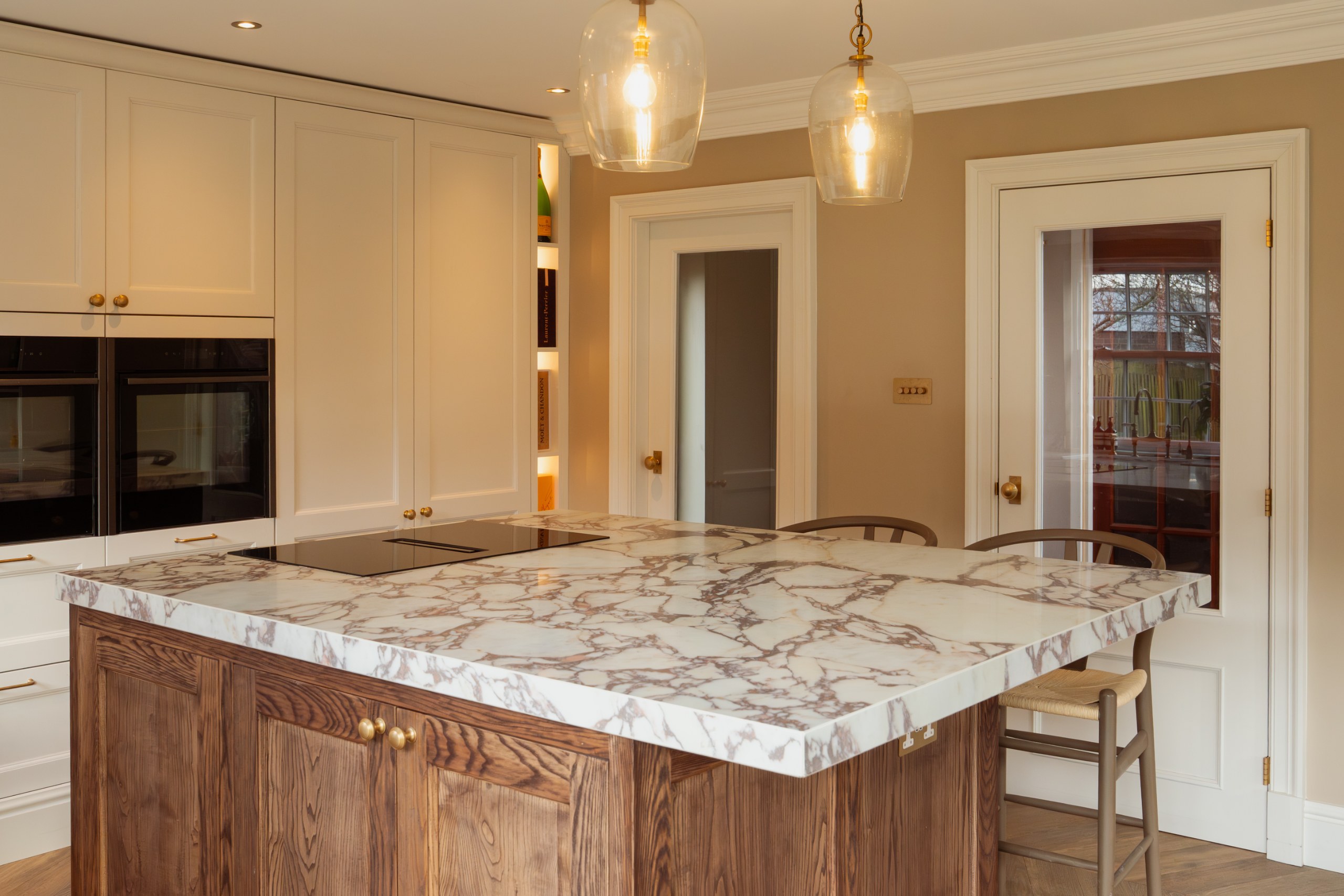
Something like Calacatta Viola Quartz Worktop or Macchia Vecchia Quartz Worktop works perfectly for this. Strong movement, lots of character — but best when it’s not everywhere.
We’ve seen kitchens where the island becomes the focal point, using one of these more dramatic designs, while the rest of the worktops stay simple. It creates balance without losing impact.
Another interesting option is Arabescato Quartz Worktop or even Calacatta Monet Quartz, which have a more broken, artistic pattern. Slightly less predictable, which some people prefer.
Dark Surfaces and Deep Contrast
Darker worktops have definitely grown in popularity, especially in larger kitchens.
They add contrast, depth, and can make a space feel more grounded.
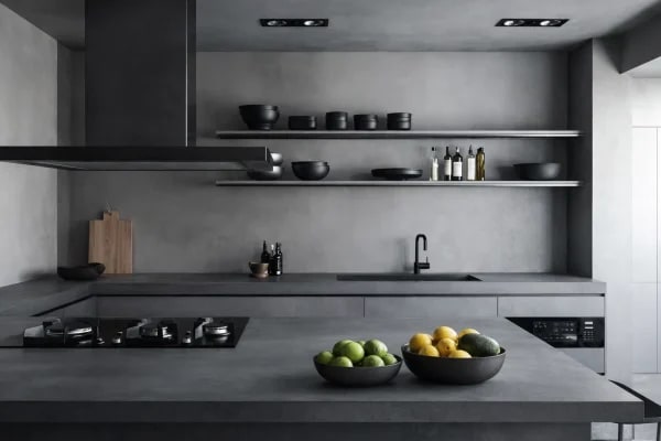
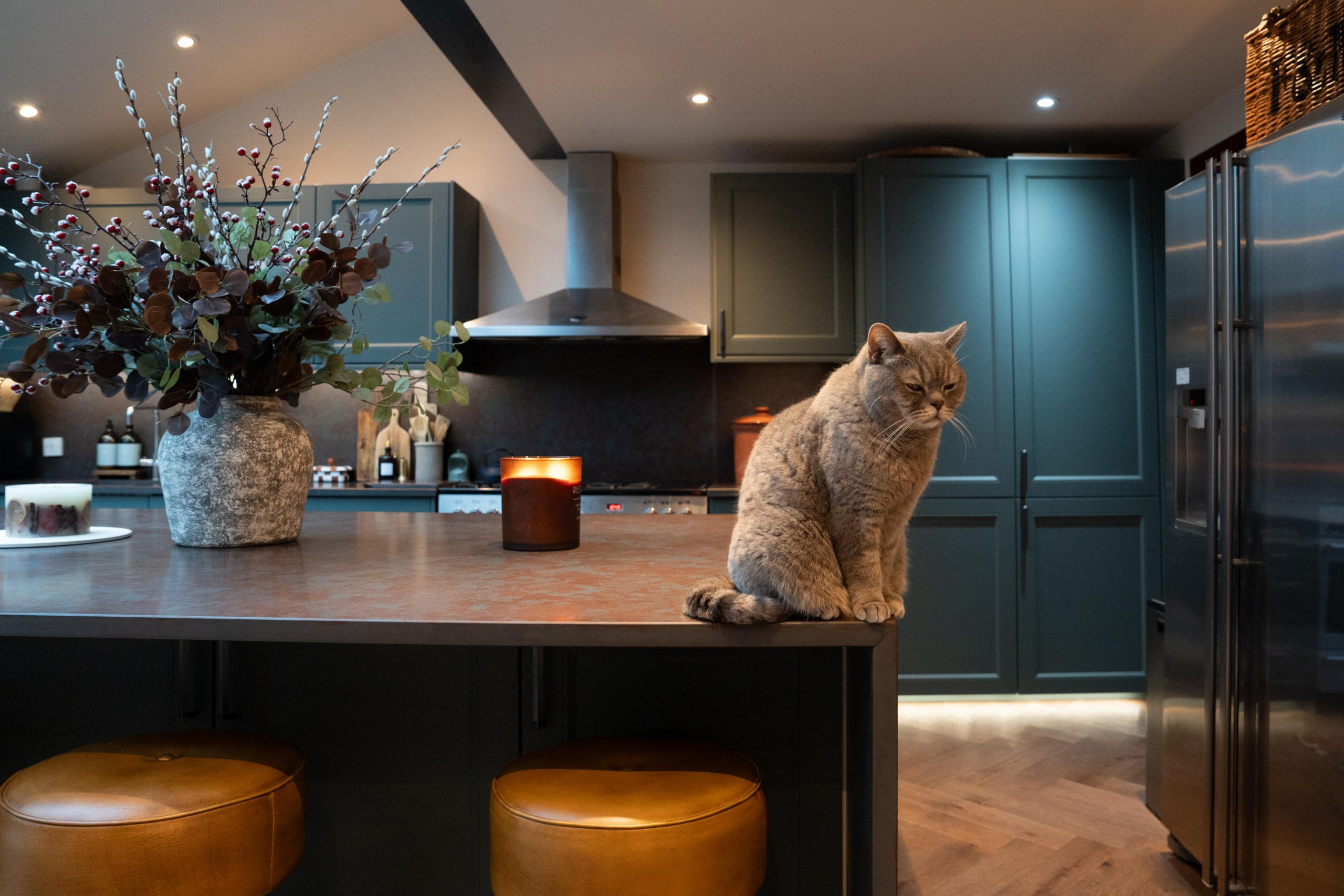
For a more industrial or modern look, something like Concrete Quartz Worktop works really well. It’s not fully black, nor grey — somewhere in between, with texture.
If you want something more dramatic, Iron Ore Quartz Worktop or even Laurent Sintered Stone brings a completely different mood. Dark base, rich detailing — very bold, but in the right space, it looks incredible.
These tend to work best when:
- There’s good natural light
- You pair them with lighter cabinetry
- Or mix them with wood to soften the look
It’s not for every kitchen, but when it works, it really stands out.
Greige Still Has Its Place
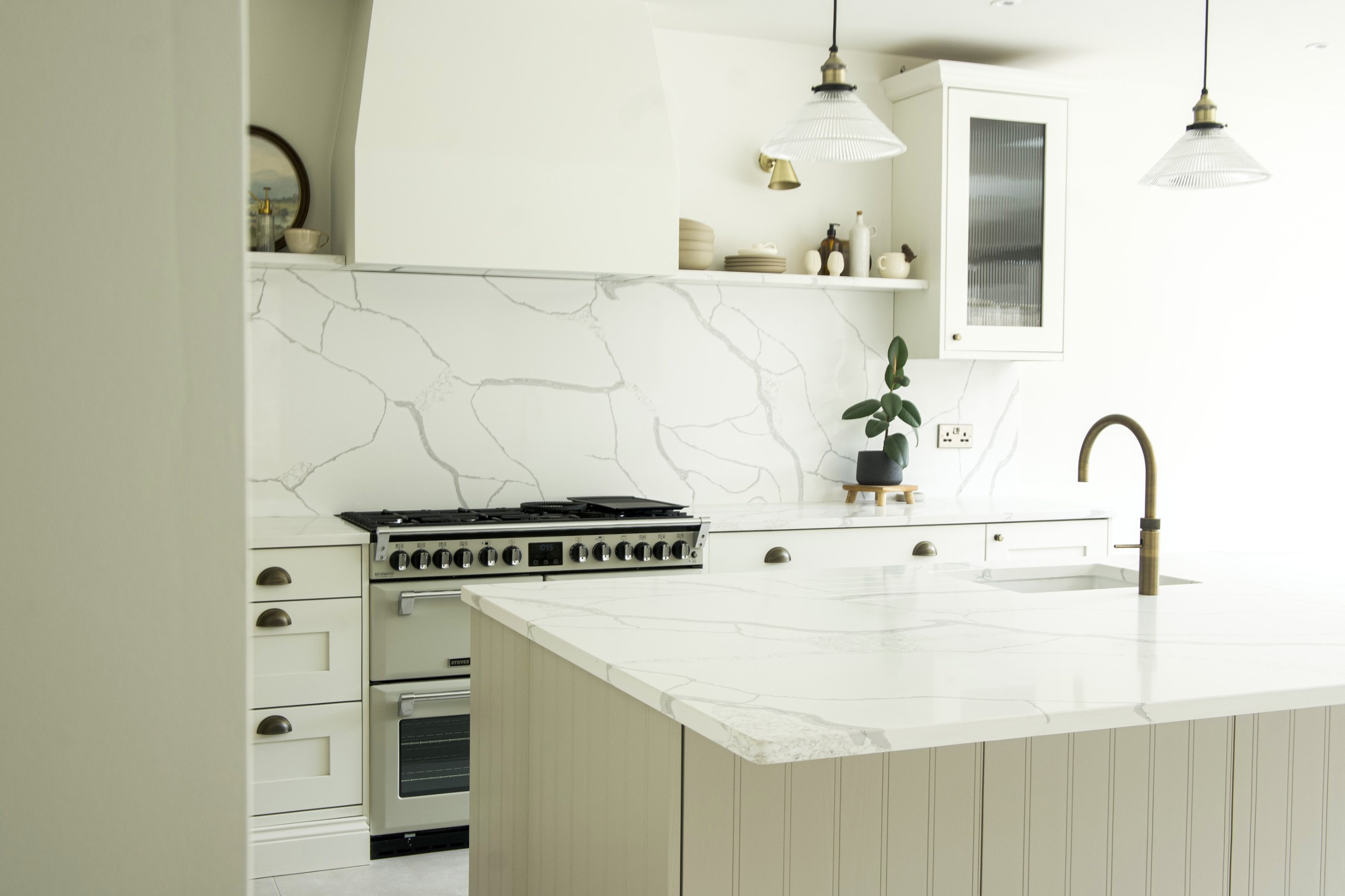
Grey hasn’t disappeared — it’s just softened.
Instead of cool, blue-toned greys, we’re seeing more “greige”. A mix between grey and beige that works across different styles.
If someone isn’t sure what to choose, this is often where they end up.
Something like Calacatta Venato Quartz or even Ice White Quartz Worktop can sit in that middle ground, depending on the setting. They’re not too warm, not too cold.
It’s a good option if:
- You want something neutral
- You’re thinking long-term
- Or you don’t want to take too many risks
It might not be the most exciting choice, but it’s one of the easiest to live with.
Natural Stone Is Coming Back for Character
While quartz is still leading overall, more people are starting to look at natural stone again — mainly for its uniqueness.
Every slab is different. Slight variations, imperfections, movement — that’s exactly what people are starting to appreciate more.
For example, Rosa Arabescato marble worktop has a softness and complexity that engineered surfaces sometimes can’t fully replicate.
Or something like Verde Green Quartzite Worktop, which brings colour without feeling artificial.
These aren’t always the most practical option for everyone, but they offer something different. And in higher-end kitchens, that uniqueness matters.
Mixing Materials Is Becoming Normal
One of the biggest changes we’ve noticed is that people aren’t sticking to one material anymore.
You might have:
- Quartz on the main worktops
- Natural stone on the island
- Sintered stone on splashbacks
It sounds complicated, but when it’s done right, it actually looks more considered.
For example, pairing something simple like Palermo Quartz Worktop with a more textured or bold surface on the island can create a much more interesting space than using one material everywhere.
It also allows you to take a bit more risk in certain areas without committing fully.
Final Thoughts
Worktop trends going into 2026 aren’t really about one colour suddenly taking over everything.
It’s more of a gradual shift in how people approach their kitchens.
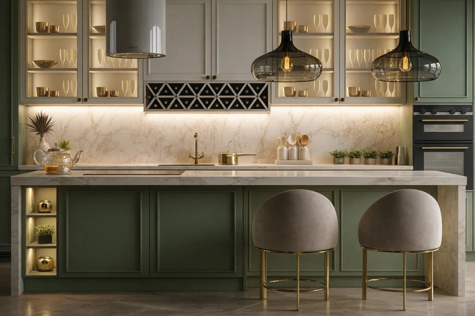
Less contrast, more warmth. Less “showroom perfect”, more something that feels comfortable to live with every day. You’re seeing more texture, more natural tones, and a bit more confidence in mixing things rather than sticking to one safe option.
Whether it’s quartz, sintered stone or natural stone, there’s simply more freedom now than there used to be.
If anything, the biggest mistake is rushing the decision.
It’s always worth seeing the full slabs if you can, looking at them in different lighting, and just giving yourself a bit of time with it. What looks good straight away isn’t always what you end up loving long-term.
And usually, when it clicks… it’s pretty obvious.