Why Grey Worktops Are Falling Out of Favour (And What People Are Choosing Instead)
- April 21, 2026
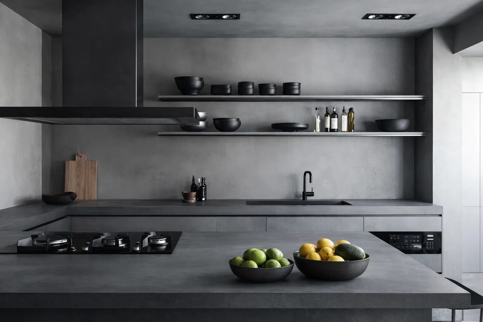
Table of Contents
Not that long ago, grey was the safe choice for pretty much every kitchen.
If someone wasn’t sure what to go for, they’d end up with grey worktops, grey cabinets… sometimes even grey flooring to match. It just felt like the easiest option — clean, modern, and hard to get wrong.
And to be fair, it did the job for a while.
But lately, it’s been changing. Not suddenly, just gradually. People still ask about grey when they first come in, but once they start looking around properly, it’s not always what they go for in the end.
There’s nothing “wrong” with it; it just doesn’t have the same feel anymore. A lot of the time, it can come across a bit flat, especially once it’s actually in a home rather than a showroom.
And once you start noticing that, it’s hard to unsee it.
The Problem With All-Grey Kitchens
Grey hasn’t disappeared, but it’s definitely not the automatic choice anymore.
One thing we hear quite a lot is that it looks great in photos, but feels different in real life. In a showroom with perfect lighting, it can look sharp and well put together. At home — especially with typical UK lighting — it can feel a bit dull, sometimes even slightly cold.
We’ve had people bring in inspiration photos thinking that’s exactly what they want, then after looking at a few slabs in person, they pause a bit. It’s not always obvious straight away, but something just feels like it’s missing.
Usually, it’s warmth.
And once they compare it with softer or more natural tones, that’s when the shift happens.
Even finishes like concrete-style quartz, which were quite popular before, are being picked less now. Not because they don’t look good, but because people are leaning towards surfaces with a bit more depth and character.
Warmer Whites Are Taking Over
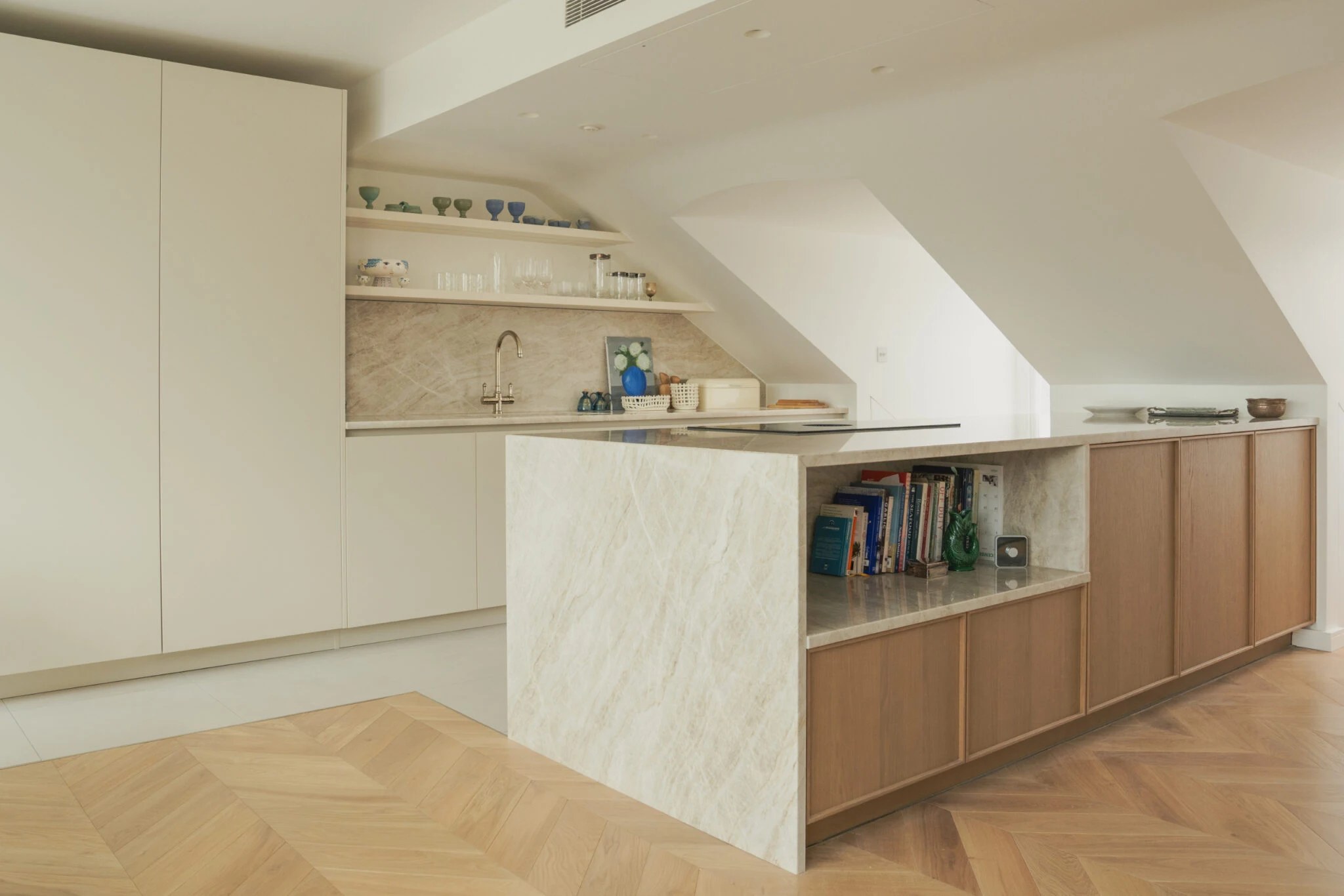
The biggest replacement for grey isn’t bold colour – it’s warmer white.
Not the bright, stark white with sharp contrast veining, but softer tones that feel more natural. Slightly creamy backgrounds, gentle movement, and a bit of warmth that works better with modern interiors.
Something like Calacatta Oro Quartz is a good example of this shift. You still get that marble-inspired look, but it doesn’t feel cold or overly polished.
Even simpler options like Enzo Quartz are becoming more popular for the same reason. Clean, understated, but not clinical.
These work especially well with:
Light wood kitchens
Off-white or beige cabinets
Warmer metallic finishes like brass
It’s still a safe choice — just a better version of what “safe” used to be.
Beige and Natural Tones Are Back
A few years ago, beige would have been the last thing most people considered. Now it’s one of the fastest-growing choices.
But it’s not the flat, yellow-toned beige from older kitchens. It’s more refined, more natural, and often inspired by real stone.
Taj Mahal Quartz is a perfect example. It has that soft warmth without feeling heavy, and it works across a lot of different styles.
We’ve seen customers who were originally set on grey completely change direction once they see something like this in a full slab. It just feels easier to live with.
It’s also more forgiving. It doesn’t show every mark or variation in lighting the same way colder tones sometimes do.
Statement Veining Instead of Flat Colour
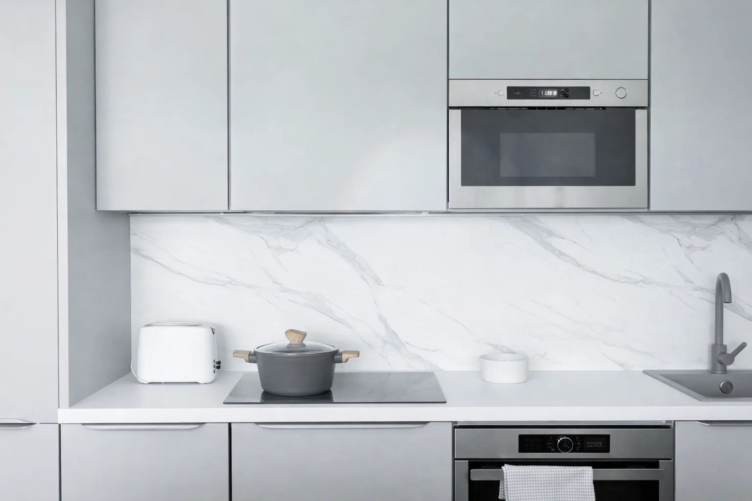
Another shift is how people are using patterns. Instead of flat colours (which grey often falls into), more people are choosing surfaces with movement and character — but using them more selectively.
Rather than covering the entire kitchen, they’ll focus on a feature area like the island.
That’s where materials like Calacatta Viola or Macchia Vecchia Quartz come in. Strong veining, bold personality — but used in the right place, not everywhere.
There’s also a growing interest in slightly more artistic patterns like Arabescato or Calacatta Monet, where the veining feels less uniform and a bit more natural.
It gives the kitchen a focal point, rather than everything blending into one tone.